PERFECTICE REDESIGN
Perfectice is an online platform that helps instituations create a campus like experience online with it’s classroom and examination modules. The goal of this redesign was to make the application more user friendly as well as feature rich such that it delivers a seemless user experience.
MY ROLE
TIMELINE
Research, User Flows, Sketching, Wireframing, Data visualization and analytics, Semantics management
7 months

THE CHALLENGE
With the target audience mostly being students, their short attention span when it comes to online learning and lack of interest when it comes to studying/taking tests posed an interesting problem. Furthermore, the large number of data points derived also meant that making sure that the usage of data had to be done in a way such that it benefits the user and doesn’t cause cognitive overload
FINAL DELIVERABLES
1. Design an app that allows users to easily use on the go and make sure the users are able to make use of the vast amount of features available to them
2. Discover and implement new features that are needed by the users
3. Maintain the current logo but explore UI elements
PROCESS

1. Discovery and Research
COMPETITOR REVIEW ANALYSIS
Started with competitor analysis to get an idea of what the current industry standards are and also so that we could get a grasp of what the users wanted. This was mostly done by compiling all the reviews of competitors and seeing what issues users experienced
.png)
.png)
.png)
2. Defining the problem statement
HEURISTIC EVALUATION
Heuristic evaluation was done to identify problems that already existed in the existing UI of the application. This made sure that these issues won't remain in the new version of the application.


SECONDARY RESEARCH
Secondary research was done to get a more clear idea on what the users wanted, this data was then compiled and mapped out on a miro board
Students found online classes and tests less interactive and more boring

Students forgot about most assignment deadlines since they weren’t reminded frequently
The UI in a few classroom based applications were tough to navigate
%201.png)
3. Ideation and mid-fi wireframes
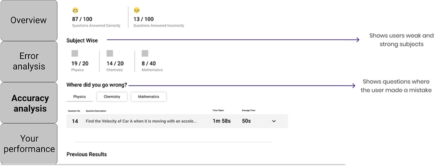
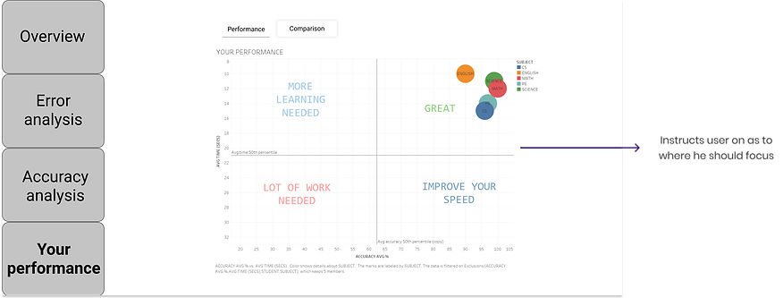
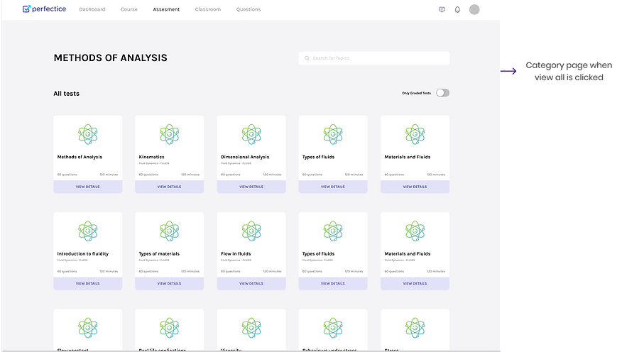
By now we had already gathered enough information to get started with the wireframes. I created this set of mid-fidelity wireframes of all of the key screens needed to complete the main user tasks that I will be testing for: finding and choosing tests to attempt, seeing test report after the test, and seeing insights/analysis on profile page . A design sprint was planned to carry out this process efficiently
DESIGN SPRINT PLANNING
%201.png)
MID-FI WIREFRAMES
CHOOSING TESTS TO ATTEMPT

TEST REPORT


PROFILE ANALYSIS


4. Visual design and UI
STYLE GUIDE AND FINAL WIREFRAMES
Once the lo-fi wireframes were made, a design system was made so that it provided a better understanding for the future developers as well as the design team. This design system was used to make the hi-fidelity screens

SCREENS SCREENS SCREENS
CHOOSING TESTS TO ATTEMPT


TEST REPORT


PROFILE ANALYSIS


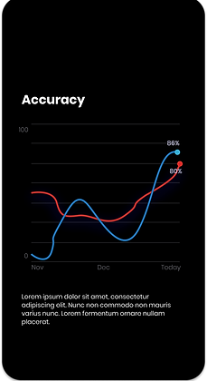
Some screens from the mobile version


5. Analytics for cards and behaviour detection
The hover cards pushed out insights and analytics to help the user out and encourage them to take more tests. I designed a system to use data to detect(which may/may not be completely accurate) what type of a student the user is and push out certain statements and insights based on that. For example, statements like “this test contains 46 questions from your weak topic that you haven’t attempted before” were pushed out to students that generally scored high to challenge them to take another test.

Types of cards

Basic
Normal tests with marks as well as time-limit. Marks are not entered in the report card, the purpose of the card is to simulate the experience of an exam.
Learning
Tests with unlimited questions, no marks or time limits. The purpose is to allow the student to practise as many questions as possible in one sitting.


E-Proctor
As the name suggests, a proctored exam with the purpose of conducting real-time university exams.
Different statements for different types of users
%201.png)
6.Development and conclusion
Development was done after handing over the screens to the developers. Development review sessions were done regularly and templates for the angular components were decided during these sessions. The site will be going live soon. If I had more resources and time, I would have conducted user testing and identified areas to improve within the new application. I would have also looked at ways to gamify the experience so that it keeps the users engaged.