SNAPTRUDE REDESIGN
Snaptrude is a smart design tool for architecture that can directly convert hand-drawn sketch of a floorplan to a 3D BIM (Building Information Model) with just a few clicks. The goal of this redesign was to make the application more user friendly as well as feature rich such that it delivers a seemless user experience.
MY ROLE
TIMELINE
Research, User Flows, Information Architecture, Sketching, Wireframing
2 months

THE CHALLENGE
Although Snaptrude had been established for more than a year, it failed to attract aspiring as well as working architects even though it had almost all the features Sketch-up and Revit had and came at a much cheaper price. Also, the exclusive analogue sketches to digital structures feature didn't garner the attention that was expected. I was one of the four designers tasked with the redesign of the application. Each of us were made to pick different modules for redesign after the initial research.
FINAL DELIVERABLES
1. Design an app that allows users to easily use on the go
and make sure the users are able to make use of the
vast amount of features available to them
2. Discover and implement new features that are
needed by the users
3. Maintain the current logo but explore UI elements
PROCESS

1. Discovery and Research
COMPETITOR ANALYSIS
Started with competitor analysis to get an idea of what the current industry standards were so that any gap between Snaptrude and the industry could be bridged.
%201.jpg)
USER RESEARCH
To get to know how architects go around with their daily life and the issues they face in their field, we conducted 50 phone interviews.
These were the main focus questions
-
What challenges do architects face in their daily life
-
Which all software is used and why
-
What kind of issues are faced within software
-
Which software was easier to adapt to
-
What were the most used features and tools
-
What kind of features/tools would be helpful in the future
The interviews were great for quickly gathering information from a sample of the target audience, while it also allowed us to gain a deeper understanding of the participant's behaviors. The main takeaways from the interviews were:
People found it tough to use most architecte software interfaces
People weren’t able to easily translate sketches to digital structures they intended
People found it hard to learn all the existing architecture softwares
The initial comments and data were also used to arrive at a concrete task flow as well as a list of applications that were involved in the workflow..
%201.jpg)
AFFINITY MAPPING
An affinity map is often used to group similar observations together. Using all the data derived from the interviews, affinity mapping was done to diagnose complex issues and identify common issues as well as to organise recommendations and ideas from each area.
%201.jpg)
2. Defining the problem statement
MEET SHIVAM AND REBECCA
Now that the initial research was ready, I was assigned to an individual module where I choose a specific user group and work on their problems. I used the findings to construct provisional personas of two junior architects, Shivam and Rebecca, to help me understand how I can help users achieve their goal using certain features in the app and to solve the problem that is most bothering them.
Meet Shivam Sharma, a 23 year old junior architect who is excited for his career ahead and can’t wait to show everyone what he’s about!
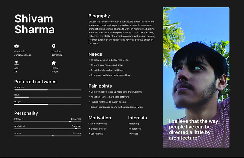
And here’s Rebecca, a 20 year old architecture student who’s passionate about architecture and has started to try out all kinds of architecture softwares!

I was given the task of solving Shivam’s problems, so, after evaluating his pain points with secondary research, I came up with the problem statement below:
%201.jpg)
EMPATHY MAPPING
Considering communication is something most architectural apps don't focus on, I created an empathy map to try and understand why exactly this problem raised. This further helped me evaluate whether collaborative features are worth building.

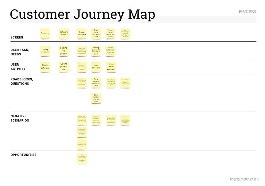
CUSTOMER JOURNEY MAPPING
To understand the stages at which the problem came up and to find opportunities for where the problem can be solved, a customer journey map was drawn out.
%201.jpg)
AS-IS JOURNEY MAP
After understanding the roadblocks that were stopping the user, I drew up an as-is journey map to understand how the user felt at each stage and what actions it resulted in.
%201.jpg)
3. Solving the problem
IDEATION AND SKETCHING
As I started to explore the problem a bit more and tried to ideate on solutions, I found it the perfect time to engage in a crazy eights exercise with the rest of the team to generate a wide variety of ideas. After all, more the brains, the more the ideas! After doing this for an hour, I chose the best three feature ideas to work on and started sketching them out in the form of paper wireframes.
%201.jpg)
%203.jpg)
%201.jpg)
%202.jpg)
%201.jpg)
%204.png)
and way more....
IA MAPPING
Most users were having trouble navigating through most of the architectural apps. Therefore, keeping this in mind, I collaborated with the rest of the team to build the Information Architecture with the new features while keeping the old IA as the base.
(The new features are marked with black sticky notes in the IA)
%201.jpg)
TO-BE JOURNEY MAPPING
A map of the to-be journey was mapped out to see and predict how the task flow with the new features would be.
%201.jpg)
MID-FI WIREFRAMES
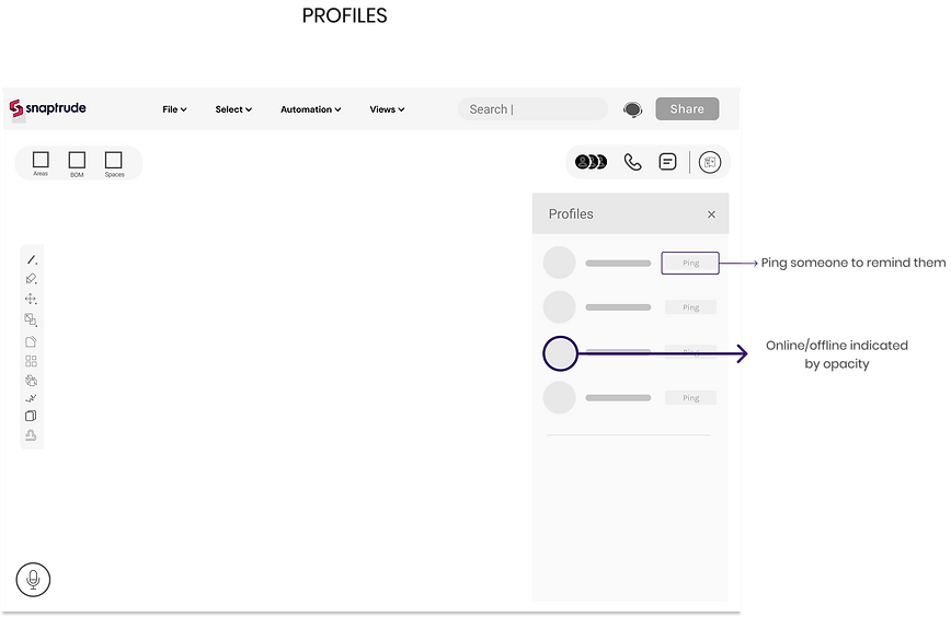
Since I had all the information necessary to get started, I created a set of mid-fidelity wireframes of all the key screens that highlight the new features, the new features being: messaging team members and other teams on the file, calling everyone on the file and making them focus on a particular cursor that is demonstrating, and the final feature being commenting as well as marking an area on the canvas.



4.Prototyping
The mid-fidelity screens were used to make a prototype .. Link to prototype :-
https://www.figma.com/file/hOqXoMfRGnuD3vjWZWeq1f/Test?node-id=0%3A5943
5. User testing and validation
USER TESTING
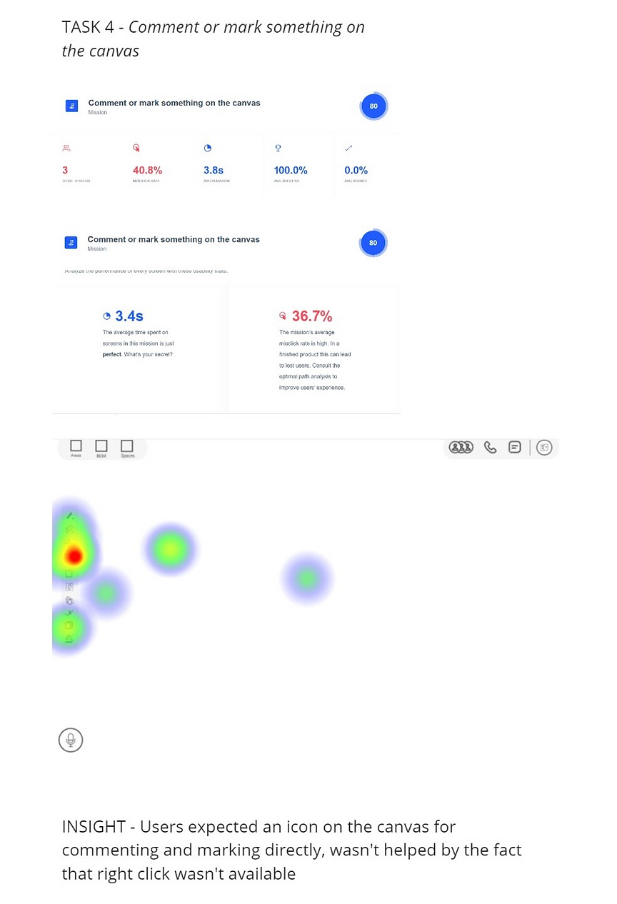
Using the prototype I made, I conducted remote user testing on maze(a user testing platform) to see how users would complete certain tasks once they were given some context. I was curious to see if the users could spot and use the new features well. The goal was to identify pain points that could be improved in future iterations. Tasks I tested for:
1. Creating a group for texting
2. Starting a call with everyone on the file
3. Pinging a person who’s online
4. Commenting/marking an area on the canvas
Link to the test:- https://t.maze.design/19210493
COMPILING AND USING FEEDBACK AS WELL AS DATA
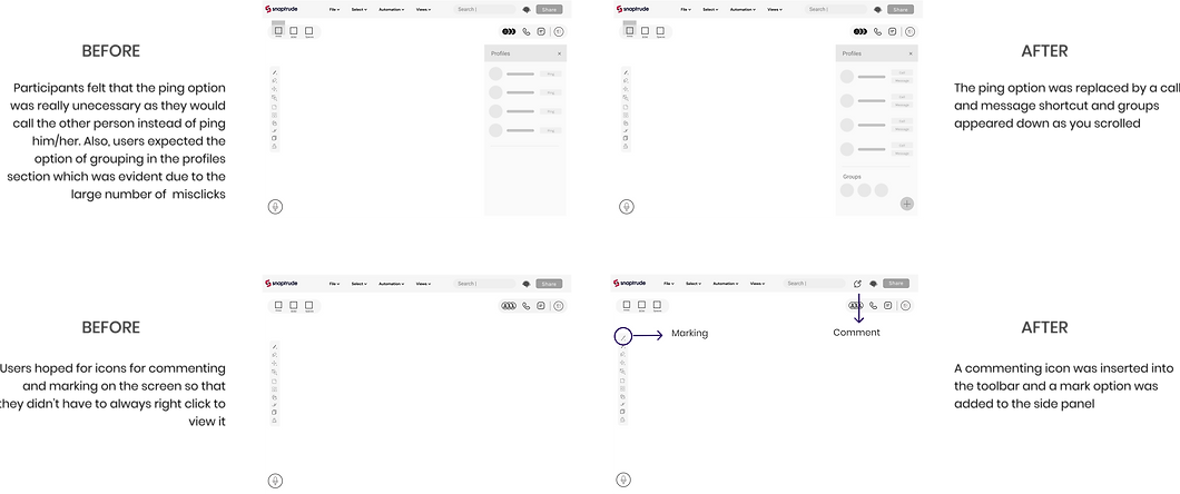
I had great feedback that made me think about the flexibility and accessibility of some features as well as visual representation of some features. Additionally, Mazes in-depth report regarding misclicks as well as hotspots gave me a lot to think about regarding how the final wireframes should be. I organised my findings and categorised them into general comments and recommendations as well as analyzed task findings based on the data given by maze.
%201.png)
%201.png)
%201.png)
RE-ITERATION AND CHANGES
Based on the feedback and the final changes documented the screens were remodified to make it more useful as well as flexible.
6. Visual design and UI
STYLE GUIDE AND FINAL WIREFRAMES
I co-ordinated with the snaptrude visual design team to come up with the style guide and personality. The style guide remained largely the same as the old version since we intended to continue with the same brand colours. The mid-fi wireframes were then handed over to the visual design team for conversion to hi-fi to which we made some UI adjustments.

THE END PRODUCT

You do the work, we'll do the rest ;)
Call on the go!
With the new call feature, you can conduct a team meeting just with one click! Also, all the spotlight will be in you!
Text and send updates!
The new messenger lets you talk to individual people too!
Mark and comment on important areas!
Mark areas you want people to see and leave a note, let it shine!
7. Conclusion and next steps
Although this project concluded with a solid prototype, I would have liked to continue testing and improving the design. The next step would be to create a more solid design system and solve issues that persist in the current software such as the clash between layers and storeys